
The Vision: A Nostalgic Yet Functional Portfolio
When I set out to design Portfolio V1, I knew I wanted something that wasn't just another cookie-cutter UI. I wanted a portfolio that reflected personality, creativity, and a hint of nostalgia. A digital space that felt both personal and engaging. That's when the idea of a retro inspired aesthetic took center stage.
Design Process & Decision Making
1️⃣ Understanding the Theme
-
The goal was to capture a retro, 80s/90s-inspired digital aesthetic, reminiscent of early operating systems, arcade games, and neon-drenched cyberpunk vibes.
-
I researched old-school UI elements like pixel art, gradient-heavy designs, and monospaced typography to get a feel for the era.
-
Inspiration: Websites like Windows 93 and Poolside FM played a significant role in shaping my vision, offering a mix of interactive nostalgia and modern web techniques.
2️⃣ Color Scheme & Typography
-
Color Palette: Dark backgrounds with vibrant neon contrasts (think electric blues, hot pinks, and deep purples).
-
Typography: Monospaced fonts mixed with bold retro typefaces to mimic old terminal aesthetics.
-
UI Elements: Flat, almost low-poly buttons and cards, mimicking classic UIs while maintaining modern usability.
📢 Fun Fact: The color choices weren't just aesthetic; they also helped with accessibility, ensuring readability with high contrast.
Why I Considered the Bento Layout (And Why I Didn't Use It)

During the design phase, I explored the Bento layout, a modern approach where elements are arranged in modular, grid-based blocks (like Apple's design language). It offers:
-
✔ Highly structured layouts that are visually appealing.
-
✔ Ease of scalability when adding more projects.
-
✔ Organized content presentation that feels intuitive.
However, I ultimately decided against it for a few reasons:
"Choosing a layout isn't just about what looks good—it's about what tells the right story for the brand."
-
❌ Too clean & modern for the retro theme – The Bento layout's minimalistic nature didn't align with the chaotic, playful vibe of the retro aesthetic.
-
❌ Lack of personality – It felt too predictable; I wanted something that had more character.
-
❌ Too rigid – A retro UI thrives on asymmetry, creative placement, and playful interactions—something a structured Bento layout wouldn't allow.
The Power of Intentional Design
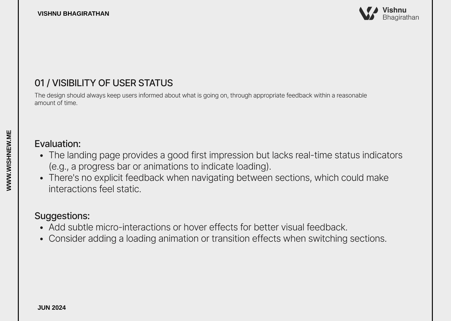
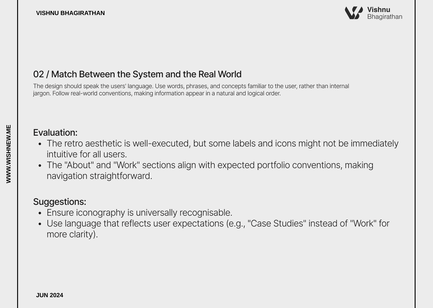
The below Heurestics evaluation was done along with multiple peer reviewers of various backgrounds and expertise
"Good design isn't just about trends; it's about storytelling. Every portfolio should reflect the designer's personality and creative vision."
Every design decision in Portfolio V1 was deliberate. From color schemes to typography and layout choices, the goal was to create a portfolio that felt authentic, unique, and functional. While modern layouts like Bento were tempting, the retro-inspired aesthetic demanded a more unconventional approach.