
Color: The Silent Communicator in UI Design
“If you're slapping random colors onto your UI without thought, you might be sabotaging your design before the user even clicks a button.”
Ever landed on a website and instantly felt calm, excited, or even hungry? That's not magic, it's color psychology at work. Whether we realize it or not, colors dictate how users feel, interact and even trust a digital product. In UI/UX design, choosing the right color scheme isn't just about aesthetics; it's about evoking emotions and guiding user behavior.
The Psychology Behind Color Choices
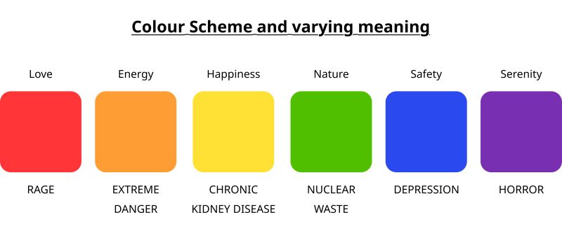
🟥 Red – Passion, urgency, hunger
(Why do you think KFC, McDonald's, and Coca-Cola love it?)
🟧 Orange – Energy, enthusiasm, and warmth
(Think Fanta, Harley Davidson)
🟨 Yellow – Optimism, happiness, but also caution
(Used by DHL, Snapchat, and warning signs alike)
🟩 Green – Nature, health, tranquility
(A go-to for eco-friendly brands like Whole Foods & Tropicana)
🟦 Blue – Trust, security, and calmness
(Favored by banks, tech companies like Facebook, LinkedIn)
🟪 Purple – Luxury, creativity, and mystery
(Think Cadbury, Twitch, Hallmark)
⚫ Black & White – Elegance, simplicity, and modernity
(Apple, Nike, and Chanel know this well)
Take a look at this visual reference that breaks down color psychology in branding:
How Color Impacts UI Design Decisions
Industry Relevance
-
Food & Beverage? Warm colors like red, orange, and yellow stimulate appetite.
-
Healthcare & Finance? Blues and greens communicate trust & stability.
-
Luxury Brands? Deep purples and blacks scream exclusivity.
Consider the below two examle for reference:


UX & Accessibility
-
High contrast = Better readability.
-
Avoid color overload (unless you're designing for a neon-themed cyberpunk UI).
-
Ensure accessibility for colorblind users—tools like WCAG Contrast Checker help!
Brand Recognition & Trust
-
The right color builds familiarity and makes your brand instantly recognizable.
-
Coca-Cola without red? Facebook without blue? Feels weird, right? That's brand power.
Check the below example where we switch colours of few famous brands and how it affects the psychology:


“Notice how Facebook dosen't seem so friendly anymore? or how KFC looks like a eco-friendly juice/fresh food beand? That's how much power colour holds in branding.”
Choosing the Right Color Scheme for Your UI
“I use tools like Adobe Color, Coolors, and Material Design Palette to experiment with schemes before committing.”
-
✔ Monochromatic: Variations of a single color—great for minimal designs.
-
✔ Analogous: Colors next to each other on the color wheel—creates harmony.
-
✔ Complementary: Opposite colors—high contrast, high impact.
-
✔ Triadic & Tetradic: Balanced yet diverse palettes—used in playful, vibrant UIs.
“Color is more than decoration—it's a powerful tool that influences mood, perception, and usability. As designers, we need to use it intentionally to craft experiences that not only look good but feel right to users.”